

In today’s tech world where technology continues to advance rapidly, it’s not surprising that visual design plays a crucial role in presentations. To craft captivating presentations it’s essential to grasp design fundamentals and apply them effectively. Visual design involves merging text, images, colours and various elements to craft presentations that are visually pleasing and impactful. Mastering the art of using design principles skillfully will enable you to develop presentations that captivate your audience inform them effectively and leave a lasting impression. This article offers a look, at crafting captivating presentations in a visual design-centric environment.
Exploring the Basics of Visual Design
Designing visuals involves blending text with images and colours to craft impactful presentations that captivate and resonate with viewers effectively. Mastering the art of applying design principles enables you to develop presentations that are not only captivating and informative but also leave a lasting impression. Moreover, visual design plays a role in crafting compelling marketing materials that resonate with audiences. The effectiveness of advertisements often hinges upon design choices such, as vibrant colours, bold graphics and other creative elements utilized in their creation.
When creating a presentation design it is important to remember visual design principles such as contrast and alignment as well as proximity and symmetry, for an appealing and impactful presentation.
Utilizing Visual Design Principles for Your Presentation
When giving a presentation it’s important to consider the contrast between your text and visuals so they complement each other well! Ensure your visuals aren’t too dark to read or that your text isn’t too light to see clearly. Additionally steer clear of bright visuals that might overshadow your text content, in the presentation. When designing your presentation it’s crucial to consider visual weight. How attention an element receives. And visual direction. The path that guides your audience’s gaze through your slides The significance of different elements like charts and graphs varies; give more visual weight to those that are key, to your message to effectively direct your audience’s focus. For instance, if you have sections of text to share with your readers it’s important to ensure they follow the right sequence. Visual flow refers to how easy it is for your audience to understand your presentation, at a glance. This flow can be disrupted by several elements on a page. Therefore strive to maintain a slide design so that your audience isn’t misled or diverted by the visual aspect. Visual hierarchy determines the sequence in which your audience will perceive the visuals. In cases such as when using charts and graphs, some visuals hold greater significance than others. Your audience needs to notice the crucial visuals early. Visual weight is key in establishing hierarchy. Yet it’s also important to consider factors, like proximity and alignment.
“Various Aspects of Visual Design Elements”
Text plays a role in visual design as one of the key elements to conveying information effectively and engaging viewers’ attention. Visual content is important; however, a presentation is incomplete without context. It is recommended to include text in every slide even if it is brief. Text can serve as either a headline or body content. A succinct headline is ideal while the body text can span sentences. Visual elements encompass forms such, as charts graph images illustrations and hand-drawn sketches. Remember that your visuals should enhance your topic rather than steal the spotlight from it. An error often seen in creating presentation visuals is overcomplicating them which can lead to confusion and make following your presentation challenging. Visual aesthetics. This involves the choice of colours and fonts as well as the selection of relevant images that complement each other well. Maintaining a visual flow. This entails considering the tempo and timing of your visuals to ensure they are delivered effectively. You shouldn’t overcrowd your slides with visuals. Have too few of them either. Aim for a balance that maintains your audience’s interest throughout the presentation by creating a cohesive visual flow and considering the sequence in which you display your visuals. The concept of rhythm is often underestimated but plays a key role, in crafting an engaging presentation visually.
Tips, for Crafting Compelling Presentations
Make sure your graphics are attractive and engaging to the eye keeping your audience interested and connected to the topic you’re presenting without causing boredom or confusion by being overly complex or unrelated to one another, in your aids. You wouldn’t want your visuals to clash with each other either—having visuals helps guide your audience through your presentation and keeps them interested! Make sure to position your visuals at the height ideally in the upper third of the slide as this area tends to capture the most attention due, to how our eyes naturally gravitate towards it. Placing your visuals in a third of the slide can help capture your audience’s attention better and encourage engagement with them effectively Ensure that your visuals are the appropriate width by positioning them to take up about two-thirds of your slide This size allows for a balanced visual representation without overwhelming the viewer Its recommended to align your visuals along the left side of your slide, for a well-composed layout that is visually appealing When positioning images in your slides to the side of the screen ensure they are placed to the left of any accompanying text for better readability and visual appeal since most individuals are right-handed. Maintain a layout by keeping the right side of your slide free from visuals while aiming for a consistent spacing, between each image to strike a balance. Not too crowded yet not too scattered. You aim to position them at the visual distance to avoid appearing too cramped or too scattered on the slide screen edges ensuring that visuals are consistently placed at a suitable distance from the edge for an optimal presentation layout without being excessively near or far away, from it.
Advice, for Creating Captivating Presentations
When preparing a presentation a common error individuals tend to make is crafting a flat layout solely focused on visuals alone. To ensure a presentation it’s advisable to incorporate textual content, on each slide.
One common error individuals often commit while crafting presentations is overcrowding each slide with a number of visuals – this can lead to a cluttered and overwhelming presentation that may hinder effective communication.
If you’re unsure about the style of your presentation it’s a good idea to get a second opinion from a friend or colleague, for honest feedback. You’ll want to ensure that your presentation is visually appealing and effectively conveys your message.
When preparing a presentation, for a crowd consider crafting multiple versions of your slides to enhance engagement with the audience visually by smoothly switching between them during your talk.
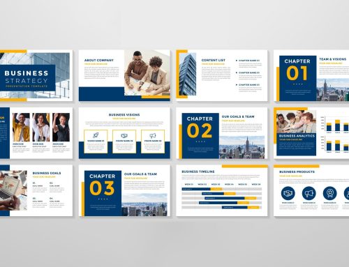
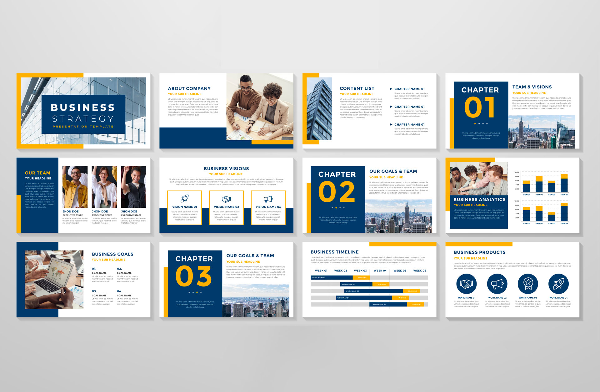
Examples of Captivating Presentations
Check out these visual presentations for inspiration.
Let’s start by checking out the “Beyond the Logo” presentation from Google. This presentation catches your eye with its use of large images that are much bigger than the text and are situated prominently on each slide’s left side rather than the centre or right side. These images maintain a presence, across various presentations indicating that they form an integral part of Google’s visual identity.
Let’s take a moment to examine an instance involving Apple products known for their designs – particularly their presentations which are visually captivating due to the utilization of prominent images and striking fonts consistently applied across various presentations, by Apple.
If you aim to make your presentations visually appealing and captivating to the eyes and minds of the audience consider incorporating images and striking fonts while maintaining a cohesive visual style throughout.


Leave A Comment