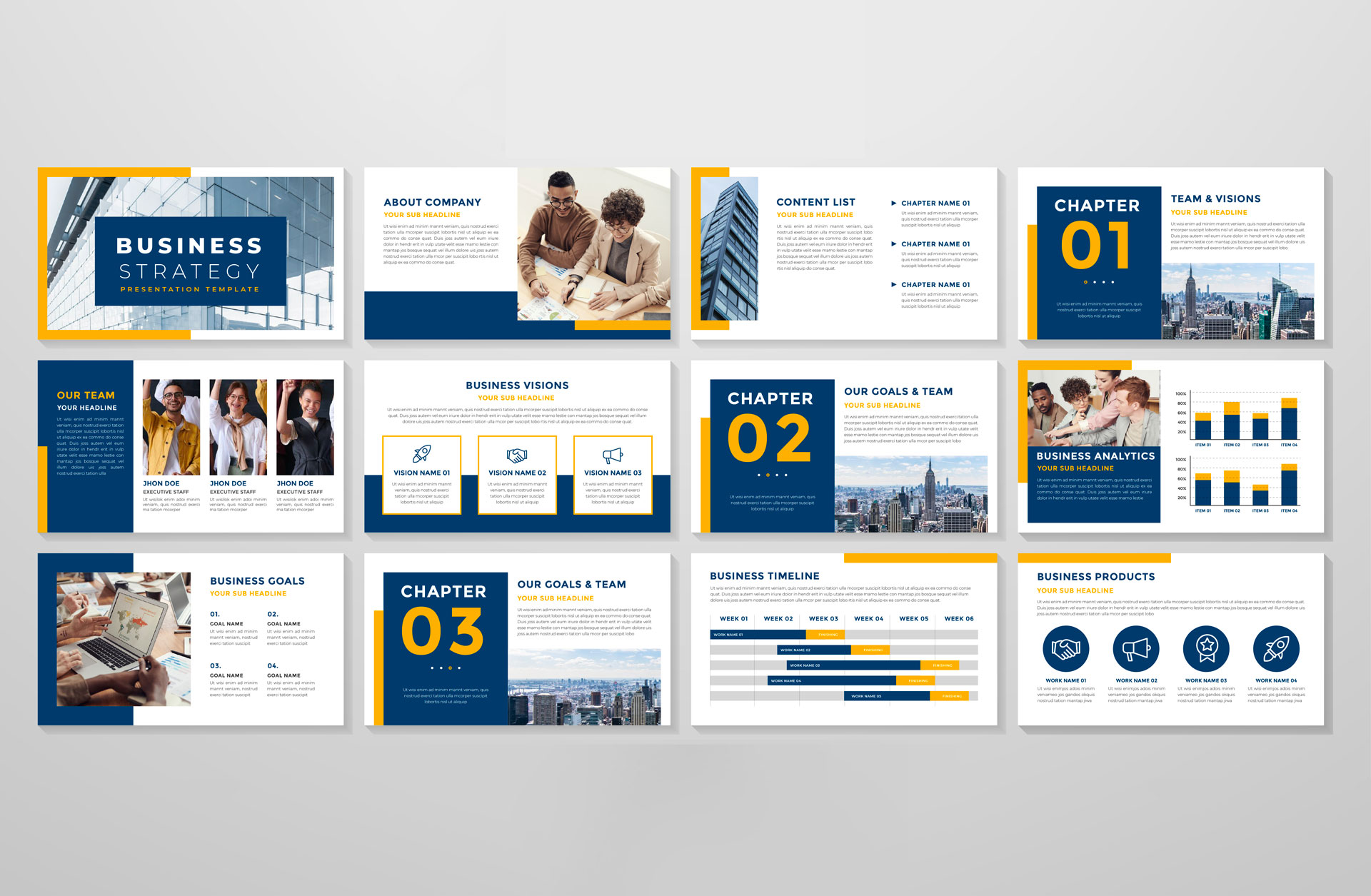
You have the research, the topic, and the audience’s interests covered. All that’s left is the presentation design — but you can’t quite find a way to make it work. Looks like you might have some more work to do. After all, an uninspiring presentation is likely to put your audience to sleep faster than a bowl of ice cream on a sunny afternoon. An ineffective presentation might even do more harm than good by coming across as unprofessional or – even worse – amateurish.
Fortunately, there are plenty of ways to improve your professional presentation design as a presenter so that it leaves an impact on your audience instead of falling flat on its face. Here are seven tips that will help you create a professional and effective PowerPoint or Keynote presentation:

Don’t rely on stock photos or templates.
If you’re using stock photos or templates for your presentation, your audience might mistake your presentation for one put on by a middle-schooler. Instead, use high-quality images and create your own templates to keep your professional presentation design consistent throughout the slide deck. Even if you can’t create custom images for every slide, try to keep your images relevant to the topic at hand. Don’t use a beach photo when you’re discussing a volcanic eruption — unless, of course, that’s the point you’re trying to make.
Find a balance between text and visuals.
There’s no need to rely on one or the other — a good balance between visuals and text will keep your audience engaged and focused on the topic at hand. You don’t have to follow the one-slide-to-one-minute rule when creating your presentation either; the rule is meant to be a guideline and not something set in stone. Keep in mind that your slides should include enough text to be engaging, but not so much that it becomes an overload for your audience. Similarly, visuals should be relevant to your topic and not just decorative elements that take up space on the slide.
Use high-quality images, video and audio.
This is a no-brainer, but it’s worth mentioning regardless: use high-quality images, video, and audio whenever possible. This will go a long way towards improving your professional presentation design — and will also make your presentation more engaging. You might want to consider hiring a photographer or videographer to take high-quality images or even record video footage for you. This will prevent you from having to scour the internet for image rights — or even worse, taking images from an image bank that could result in a copyright violation and a potential lawsuit.
Keep your slides to a minimum.
Keep your slide deck short and sweet — especially if you are presenting to a large audience. No one likes to sit through a presentation that lasts for hours. Your goal is to engage your audience and keep them interested. In other words, the shorter the better. If you expect a large audience, try to keep your presentation to about 20 minutes. If you have a smaller, more intimate group, you can probably get away with a bit longer. Either way, try to keep your slides to a minimum and don’t go overboard with the decorative elements.
Use the right font combinations.
The words that you use on your slides are likely to be the main focal point, so use the right font combinations to get your point across. One thing to keep in mind is that certain fonts are better suited for certain slides. For example, playful fonts such as Comic Sans or Curly Sue might be great for a silly infographic, but they probably aren’t the best choice for your company overview. Similarly, you should use certain font combinations to make your presentation more engaging. For example, if you’re discussing a serious topic, try to avoid playful fonts such as Comic Sans or Curly Sue and instead use more serious font combinations such as Arial or Times New Roman.
Experiment with different color schemes.
Color is a powerful tool that can completely change the atmosphere of a room. Your presentation is no exception. Try experimenting with different color schemes to see which ones fit your topic best and make your presentation pop. Keep in mind that it’s best not to use too many colors or combinations at once; too much color can be distracting and might end up hurting your presentation’s overall message. Try to use a neutral background color such as black, grey, or white, and then use a single color for your title and maybe one or two other elements such as images or graphs.
Conclusion
Presentations are often the key to success in many professional situations, so it’s important to make sure that yours stands out. With these tips in mind, you can create a presentation that is engaging and visually appealing — and that will leave a lasting impression on your audience. Now all that’s left to do is to put these tips into practice and create an engaging, professional presentation design that will leave a lasting impression on your audience.

